Information Card Layout
The card should include a concise title at the top, such as “System Status Overview”. Detailed system information can sit beneath it in a smaller or collapsed format to save space.

Designing a clear, resilient account experience for BMW dealer users, with backend status, dynamic messaging and error handling built into the flow.
BMW dealership users working with complex sales and customer-account workflows.
Defining the problem & solution · User flows & journey · Low-fi · Hi-fi · Working prototypes
Automotive / B2B · BMW ZA IT Hub · International collaboration
User research · Requirements synthesis · Figma · Agile · International collaboration · Usability testing

Workflow – Translate complex B2B workflows into an intuitive account experience.
Resilience – Make backend states and errors understandable without blocking the user unnecessarily.
Delivery – Balance user needs, technical feasibility and design fidelity.
The account journey needed to accommodate several backend conditions without leaving dealers uncertain about what was happening or what to do next.
looking at integrating APPN/MAPPING into the application for dealers
Ensure the UI can cater for dynamic messages and error handling
The tool should not confuse the user or block them when any backend system is not responsive
The user might not know what has gone wrong if the interface is unclear
Frustrated
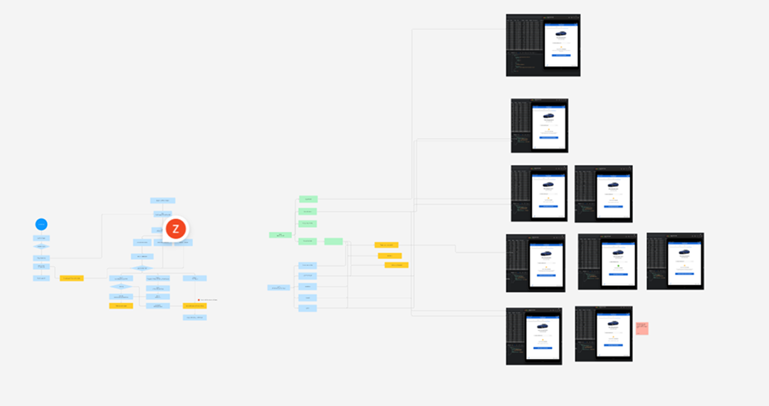
The process artefact below captures the working flow used to explore account creation, mapping and the different backend-driven outcomes.
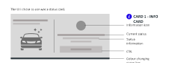
A lightweight status card gives the dealer enough information to understand the current state while keeping the primary workflow simple.
The card should include a concise title at the top, such as “System Status Overview”. Detailed system information can sit beneath it in a smaller or collapsed format to save space.
The signal colour dynamically updates from backend checks. This can be automated through an API or backend service that monitors relevant systems and returns the current status.
The signal bar should be noticeable without dominating the card. It communicates status at a glance and sits at the bottom of the card so it does not interfere with the information above.
Hover states or tooltips can provide additional context, such as “Server 1 Down”. Small service icons and a short explanation beneath the status can help users understand what the current colour means and what action is required.
I chose a simple CTA that is always enabled. If the user is unable to proceed, they can still click the button, and a relevant message will inform them of the issue.
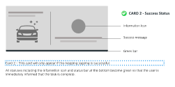
Clearer feedback when backend services are unavailable or delayed.
A more resilient dealer workflow that reduces uncertainty around account actions.
A reusable status-card pattern for communicating system health consistently.